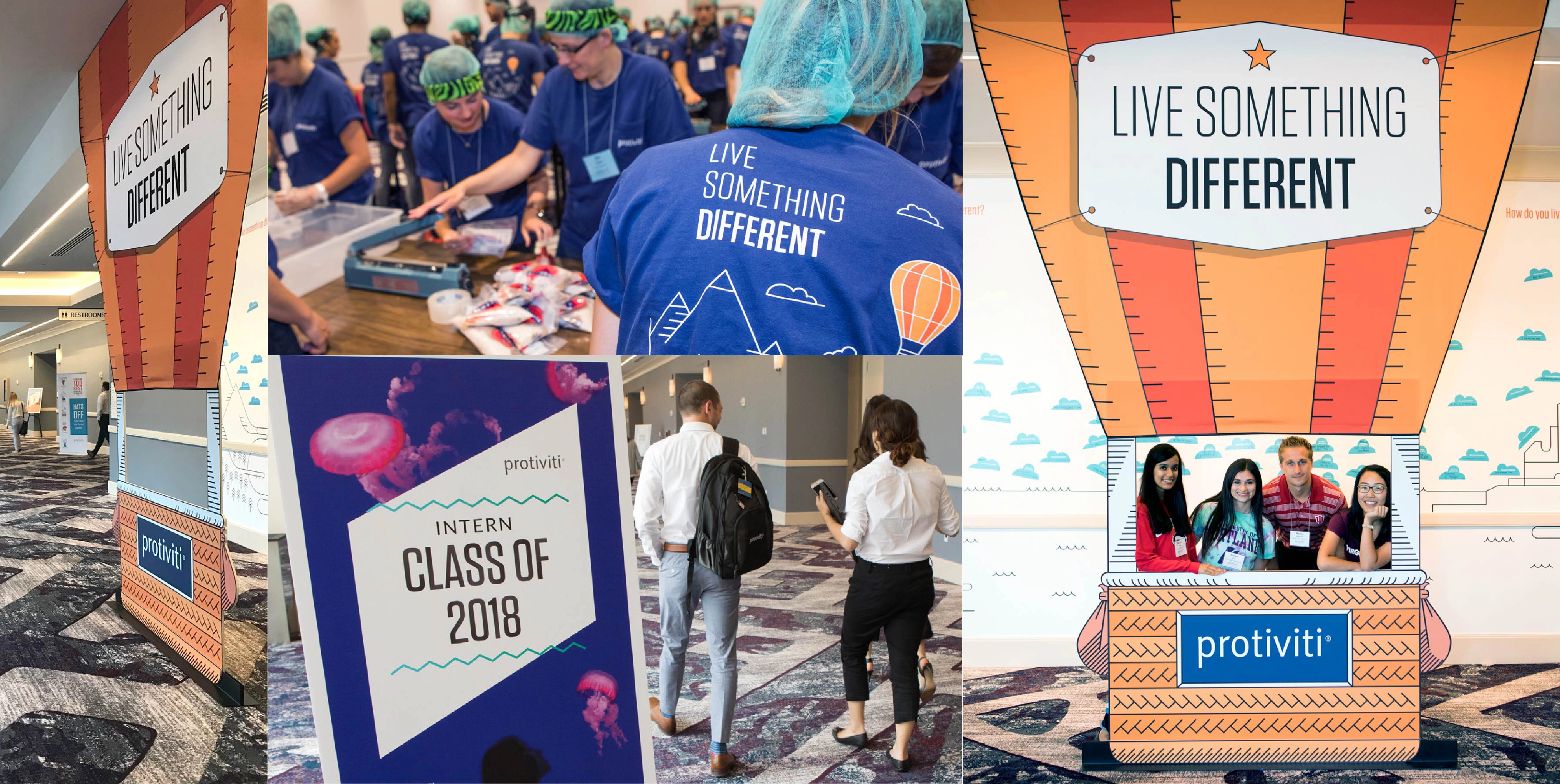
300+ college interns
art director, designer
experiential design
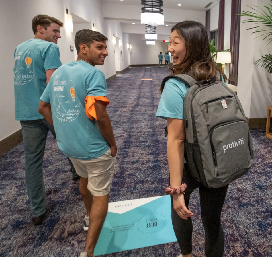
Working with a copywriter, we arrived at “Live Something Different," which evokes the exciting lifestyle of a consultant: traveling, meeting people around the world, and always learning.
As the audience is Gen Z, I studied graphics and social media popular with them. The Talent Team also was heavily invested in a photobooth concept at The Intern Challenge, so I recommended a concept that felt intentional for the messaging and shared experience.
For the photobooth concept, I concepted a “lifesize” air balloon, which symbolized how someone could actually “Live Something Different.” And I worked with a teammate on the actual illustration of the balloon and the landscape.
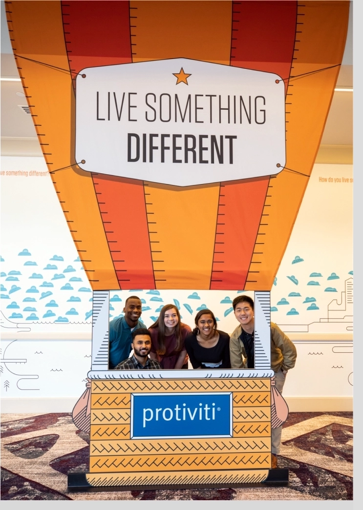
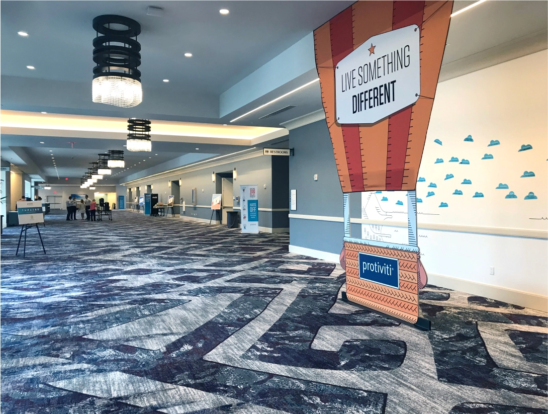
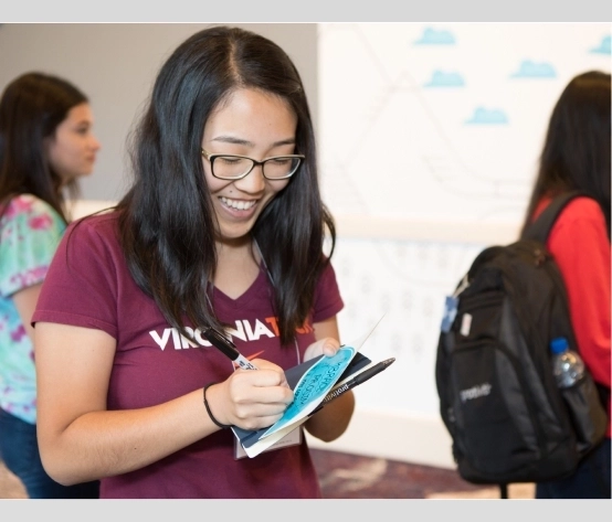
To further build out the experience and the messaging of "Live Something Different," I extended the air balloon buildout by asking the interns to write on a sticker shaped like a cloud how they “live something different.” They then adhered them on an illustrated wallscape behind the balloon.
I took inspiration from poster design and T-shirt graphics marketed to Gen Z when I originally designed a takeaway brochure for campus recruiting. TIC’s design was evolved from this brochure (seen below), which the TIC interns would have received along their journey to TIC.
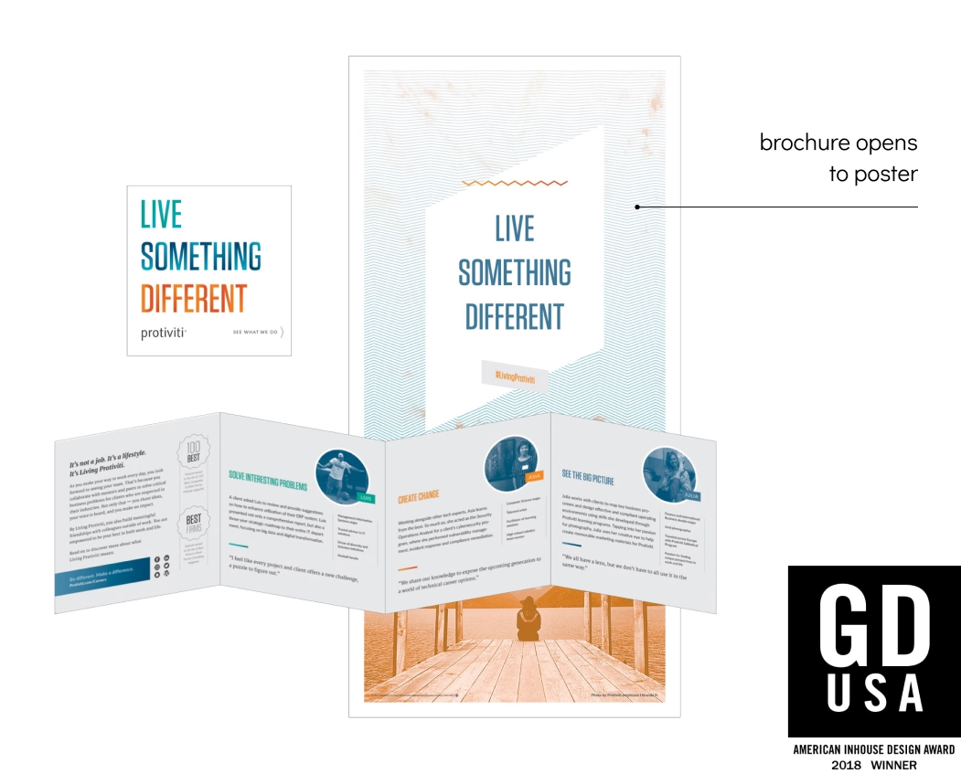
Note the squiggly lines, duotone photo, and skewed shapes. These are basic hallmarks of what I saw across the ’90s-inspired graphics aimed at Gen Z — and yet kept us still on brand, as Protivit’s brand is geometric at its core.
The most unique aspect of the brochure is that it opens to a poster, which I created with the strategy of making the brochure more of a keepsake to remind students of Protiviti long after their first interaction with Protiviti.
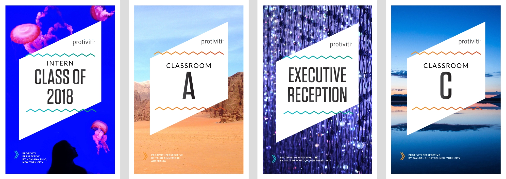
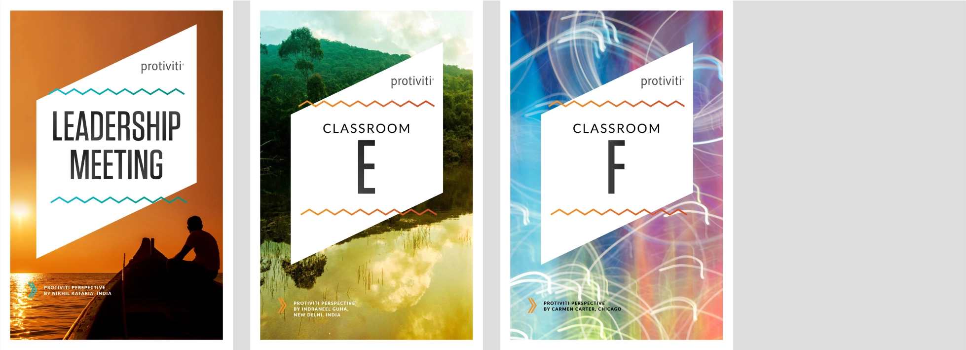
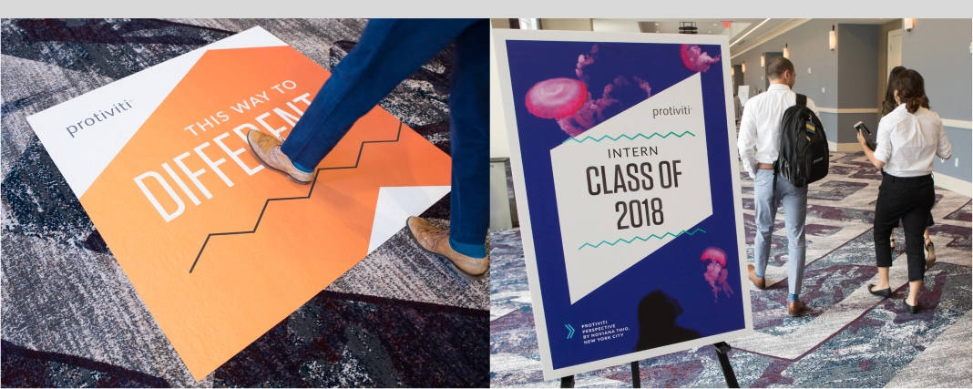
Years prior, Protiviti had asked employees to submit photos that showed their unique perspective on the world. Many of these photos exhibited qualities of “Live Something Different.” I saw an opportunity to use these photos on the many posters needed throughout the hotel grounds.

Samm has always impressed me with her professionalism, her ability to take any small idea, enhance it and build upon it to provide outstanding deliverables ... Samm is such a talented individual and such a pleasure to work with.

/ interjection / scandinavian
1 You’ve just taken in a lot! Some would call it “the end.” I, however, call it “the beginning” — perhaps of something beautiful. Let’s find out together.
© Copyright 2026, Samantha Bohn.