Cannabis & wellness enthusiasts
art director, brand designer
Branding; packaging
Terp's Candy's hard candies are dual purpose. They aid cannabis as well as wellness enthusiasts (such as those with allergies). In the absense of picking a lane — in addition to legal challenges in calling the product a supplement — we were up against a number of educational challenges.
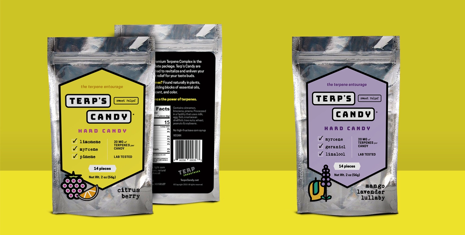
Visual cues are this brand's best strategy for combating the multiple obstacles to making its way into consumers' hearts. Common visual approaches to medicinal packaging illuminate the candies' medicinal effects, and irreverent and playful graphics, fonts and colors speak to the candy crowd.
A classic logotype provides another cue to the nature of terpenes as chemical compounds, borrowing the visual of connected atoms.
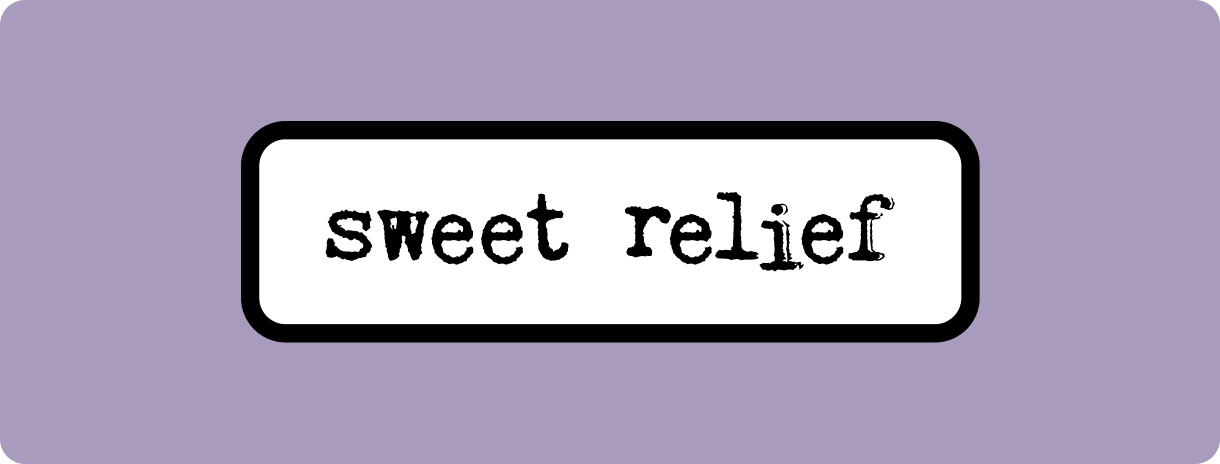
The sweet spot for a tagline? Up to 5 words and geared toward memorability. The client felt I hit the mark here with “sweet relief.” It communicates the benefits of terpenes as well as the candy category and has potential for memorability due to its internal rhyming.
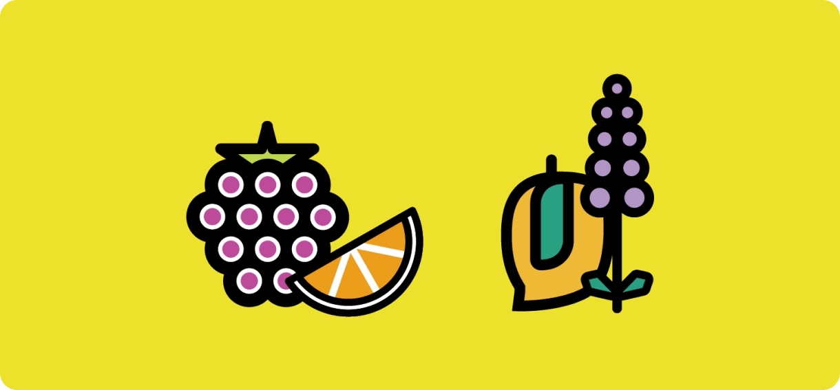
Adding a touch of whimsy and character, I created illustrations that communicate the candy’s flavor and anchor the packaging.

/ interjection / scandinavian
1 You’ve just taken in a lot! Some would call it “the end.” I, however, call it “the beginning” — perhaps of something beautiful. Let’s find out together.
© Copyright 2026, Samantha Bohn.
