
outdoors enthusiasts
art director, brand designer
identity/logo; branding; packaging
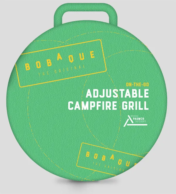
The current canvas bag is housed in a container similar to a pizza box, which is bulky and unsustainable, especially for outdoor enthusiasts who care about the environment.
While developing new packaging, Paumco was also in need of totally new identity, brand strategy, and branding.
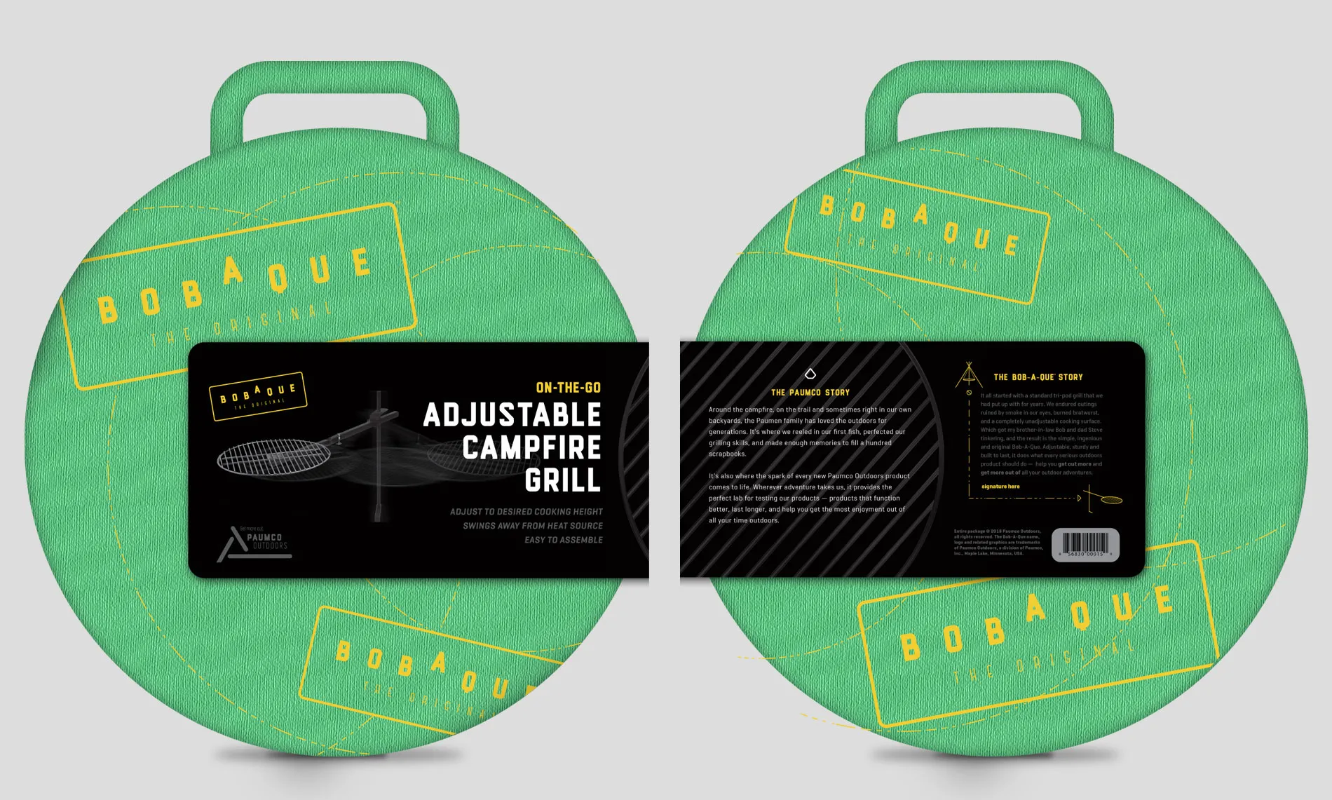
The new design is a sustainable and innovative solution that capitalizes on the bag's ability to communicate on its own as well as the originality of an asymmetrical wrap attached using plastic barbs.
When the wrap is removed, the canvas bag reiterates the brand.
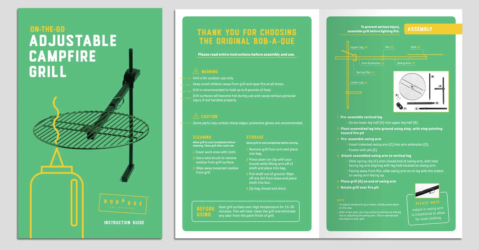
Rewritten and reorganized, the new guide ties in a whimsical illustration to introduce Paumco's lighthearted tone.
Paumco's logo is intended to be a flexible element within its brand.
Paumco's logo features an icon that hints at the numerous icons of outdoor life, all of which happen to feature a triangle shape — a bonfire, a mountain or a tent. The tagline, "get more out," was a bright moment for me as a leader. After several rounds encouraged by me, my co-worker (and boss!) dreamed up this great solution to our challenge: communicate that Paumco is set on two things foremost: 1) helping people enjoy the outdoors and 2) creating products that simplify outdoors adventures by not getting in the way of them. This tagline with double meaning accomplished just that and — even cooler — did so succinctly.
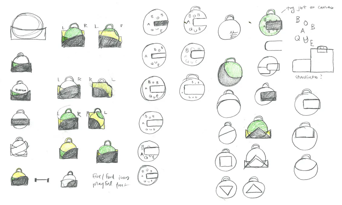
A logo for Paumco's flagship product, Bob-A-Que, evokes the triangle shape of a bonfire, all while efficiently communicating the rhythm of the product name without clunky hyphens.
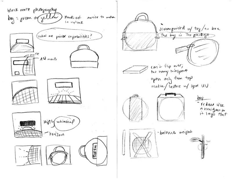
Earlier logo concepts and process work.
/ interjection / scandinavian
1 You’ve just taken in a lot! Some would call it “the end.” I, however, call it “the beginning” — perhaps of something beautiful. Let’s find out together.
© Copyright 2026, Samantha Bohn.
