pan-o-gold baking b2b brand & website revitalization
audience
wholesale buyers, including foodservice and schools
role
art director, UX designer, visual/UI designer, brand designer
project type
UX; information architecture; wireframing; UI/visual design; branding; photography art direction
challenges
Pan-O-Gold, as the Midwest's largest bread manufacturer, had no sales collateral or website listing of its products. It was a monolithic undertaking, starting with information architecture as well as brand architecture.
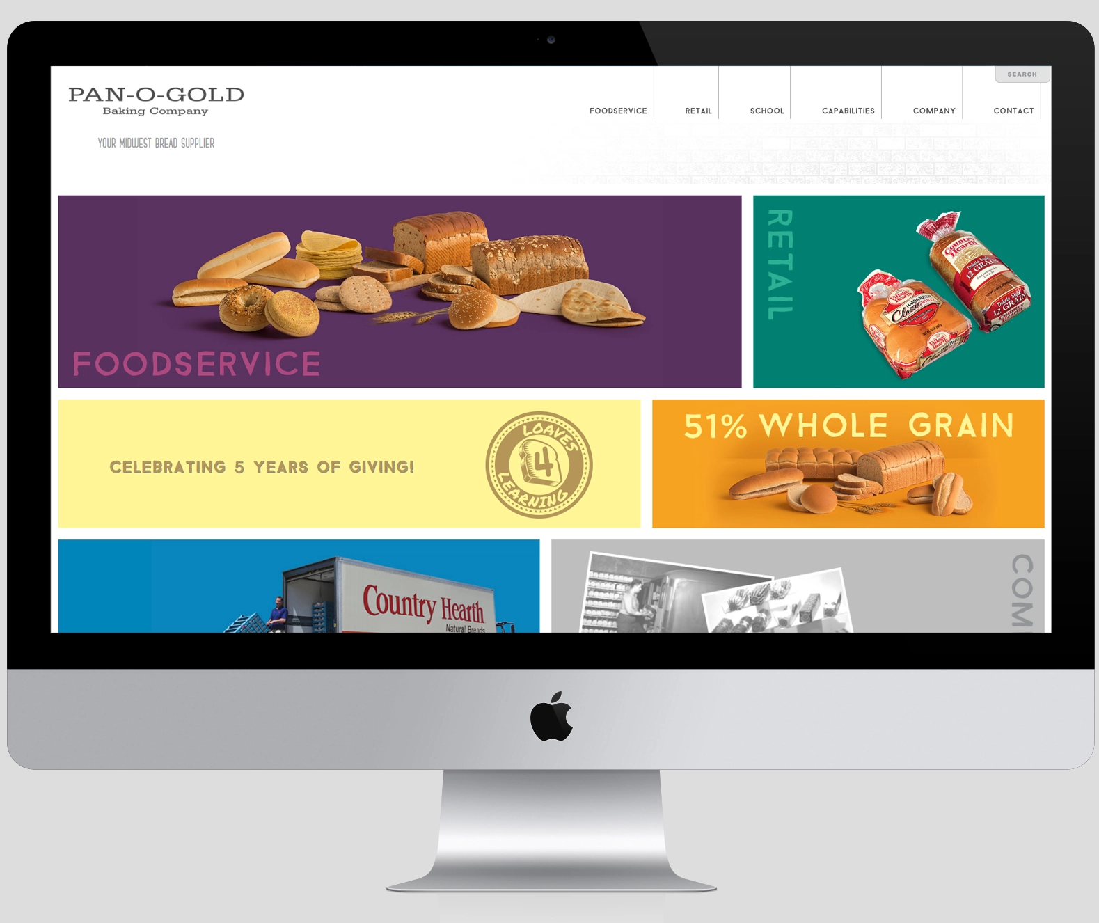
Website
A robust website featuring POG's full foodservice catalog also puts POG's capabilities front-and-center, where they previously hadn't been prominently communicated to the foodservice audience.

Photography
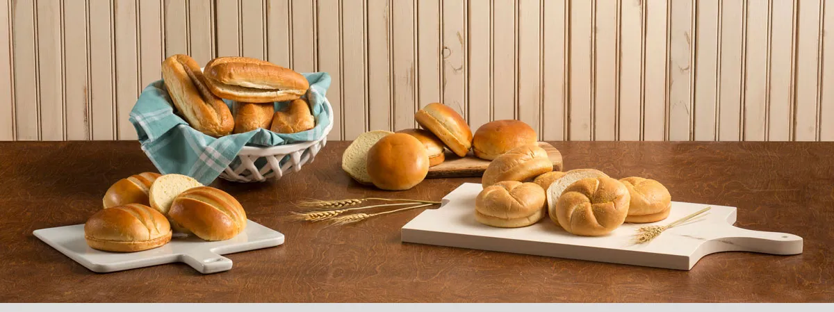
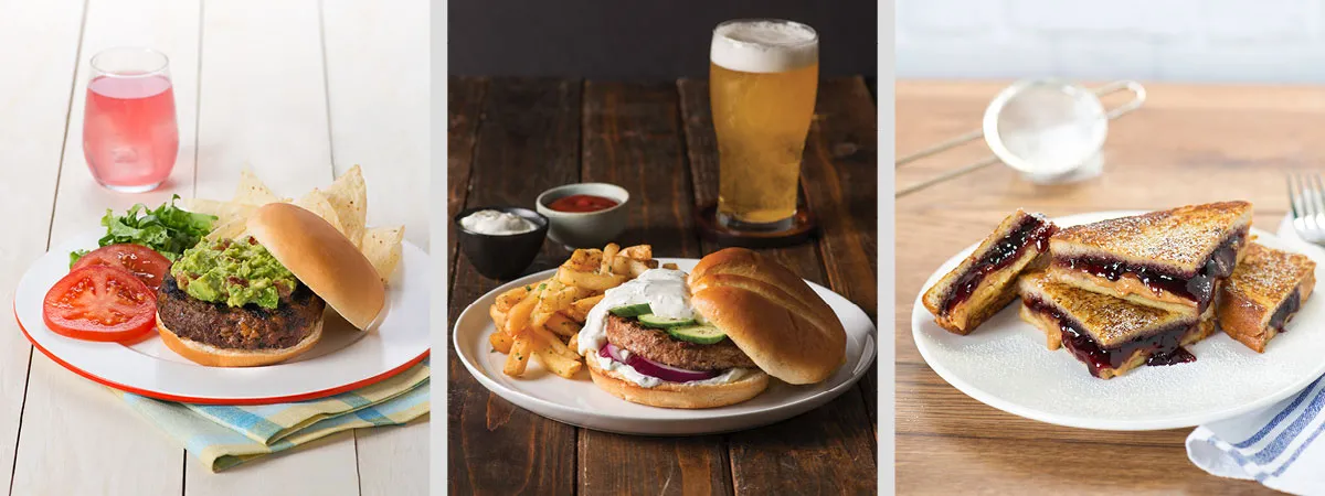
I directed both on site and remotely all product and prepared food photography and also did post-production for on-site photography.
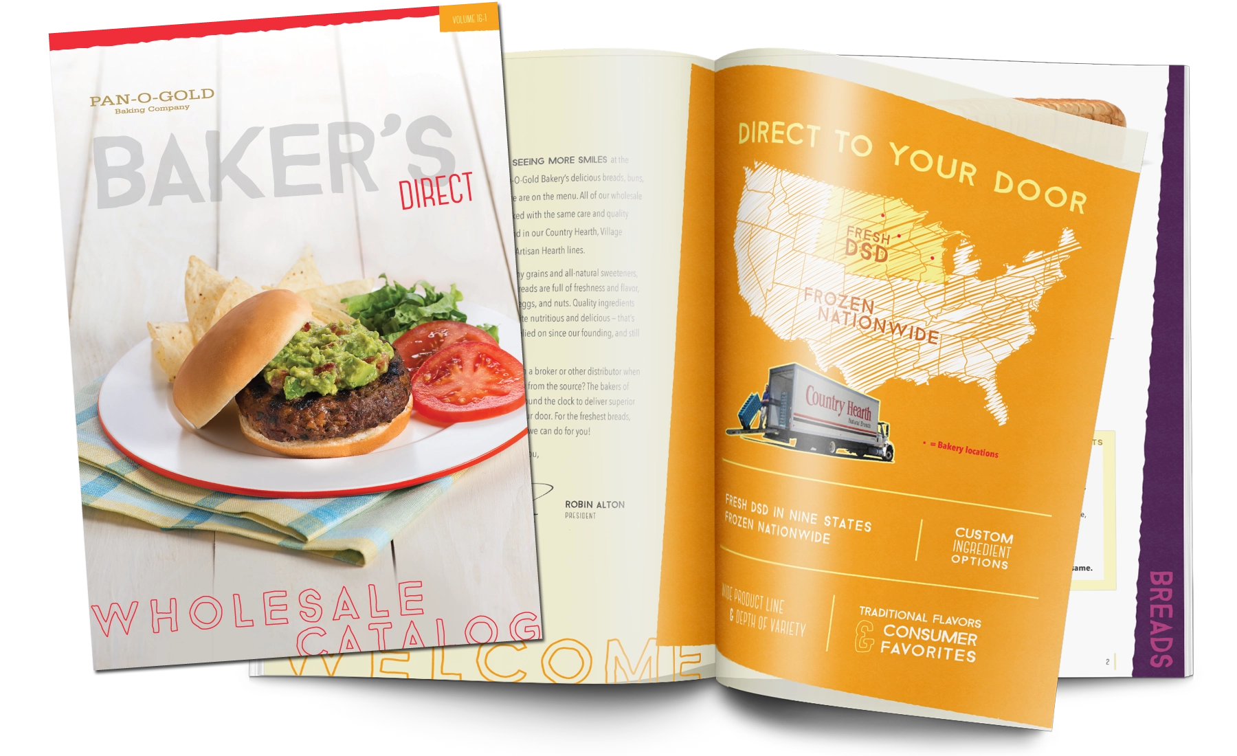
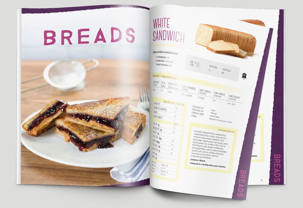
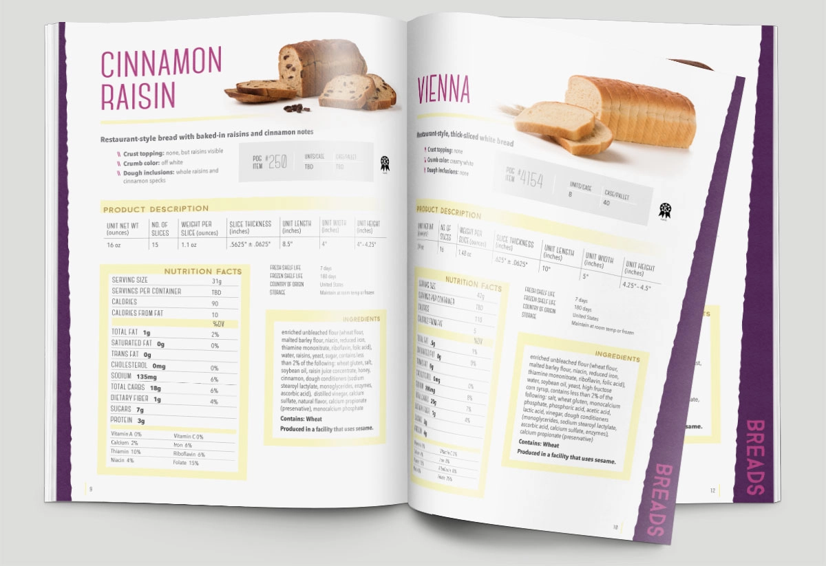
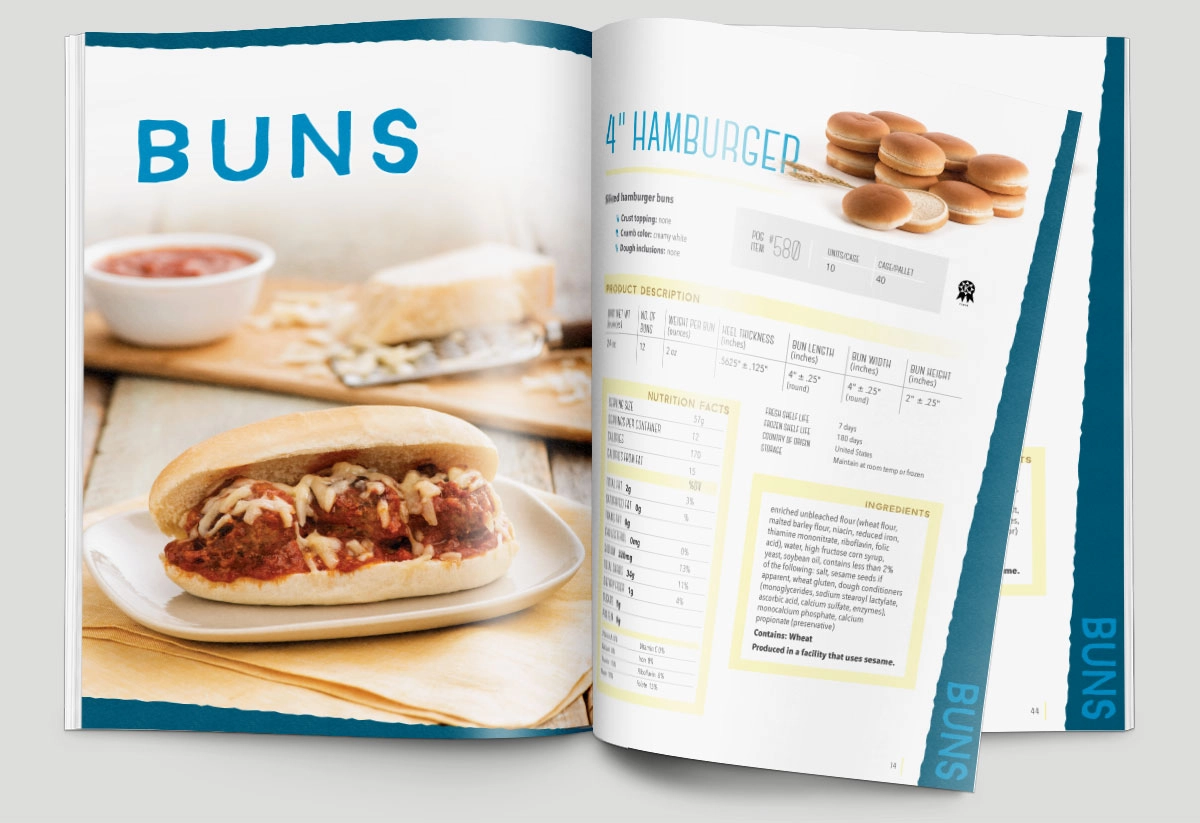
Catalog
A beautifully printed catalog presents the 100-plus foodservice products from Pan-O-Gold — from your basic bun to you artisan Kaiser. For the photography, I determined the art direction of "bright, approachable plating" and worked remotely with food stylists.
Outcome
A beautiful printed catalog stole the attention of foodservice buyers, who remarked it was the best they had ever seen. With POG's robust website and a print sales system at the ready, POG has captured the attention of more foodservice buyers with more purchasing power.