Optical offices needing specialty lenses for unique cases of patients
art director, photography art director, visual designer, brand designer
UX, UI/visual design, brand design, photoshoot
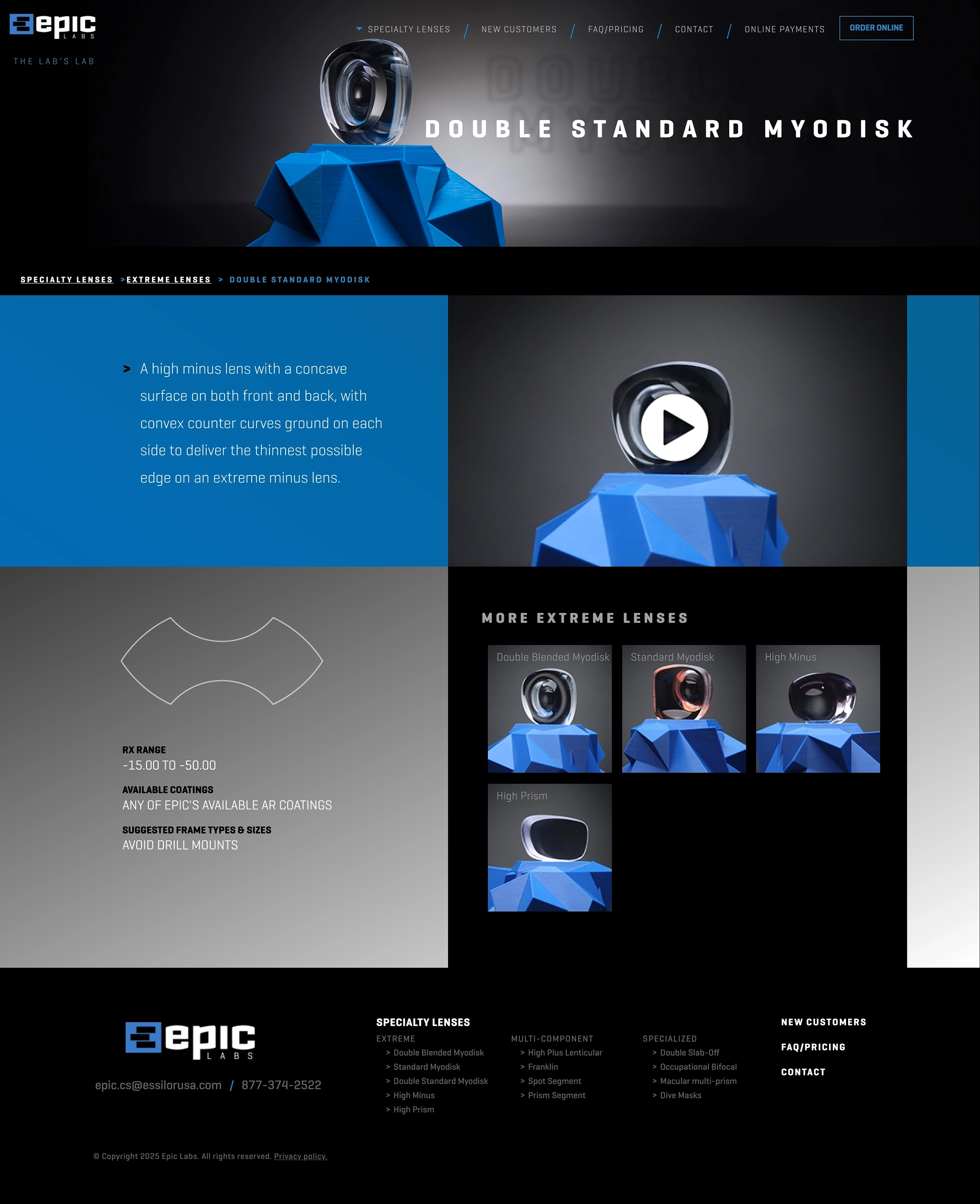
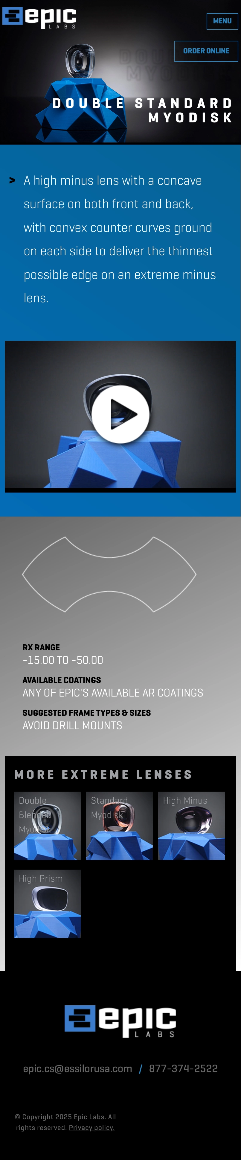
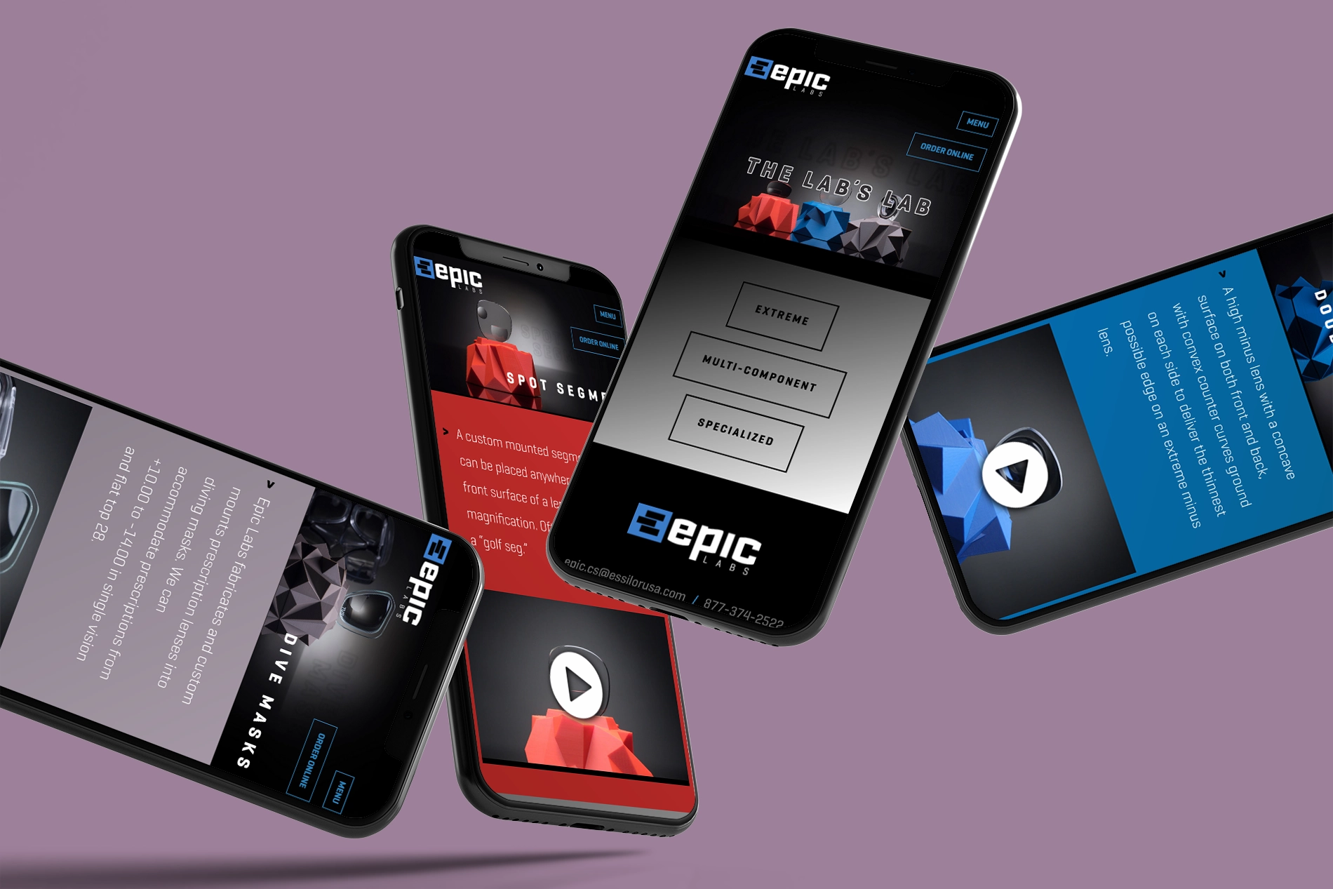
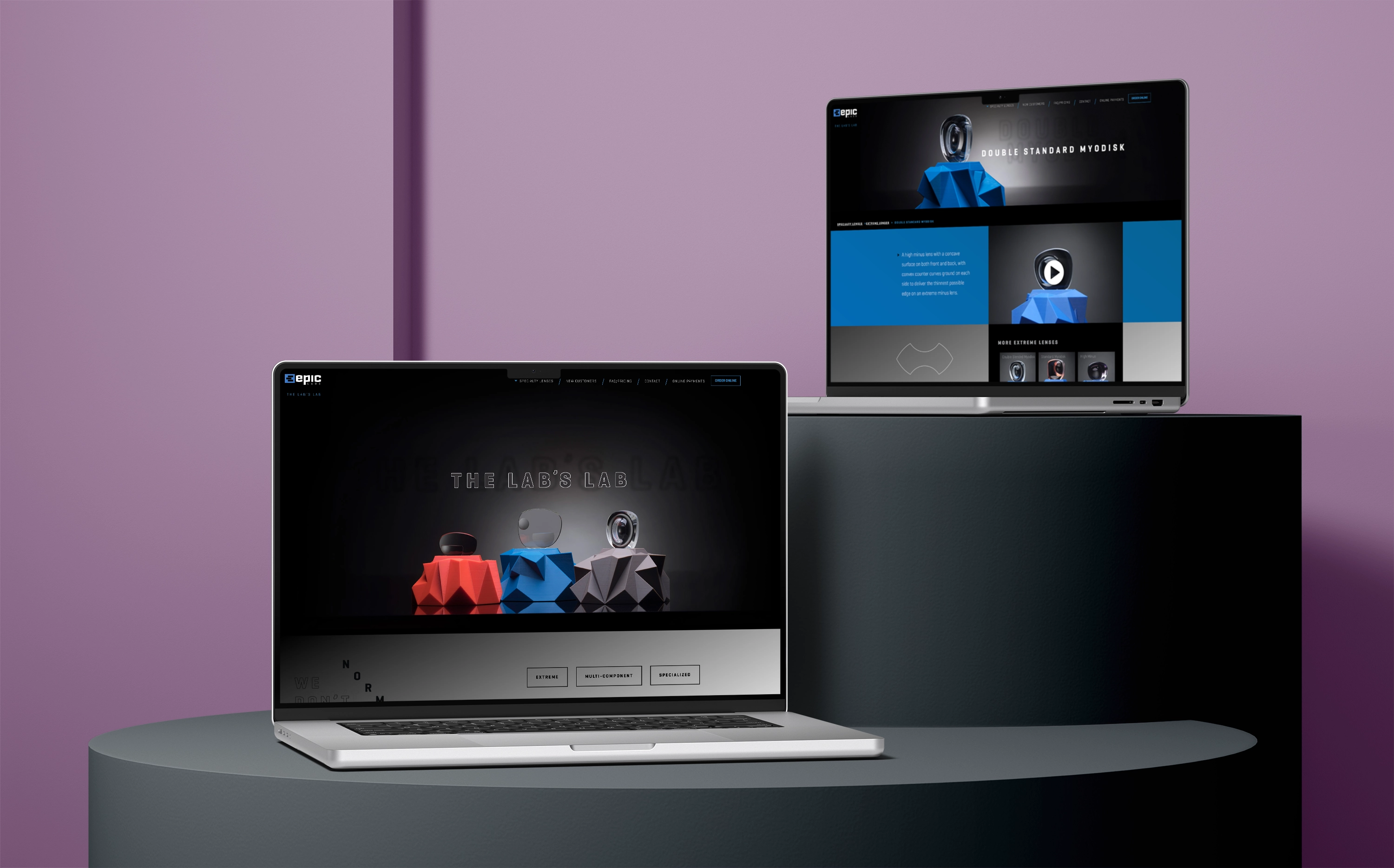
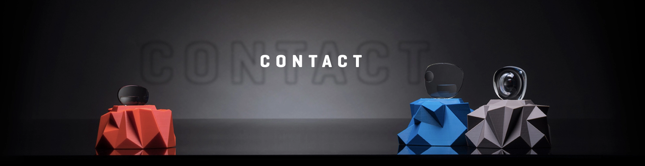
I developed the art direction of using 3D-printed geometric stages for each category of lens, which carry through to the site, seen here in the product pages. The geometry of the stages communicates the precision of the lenses that Epic makes, which only a couple of optical labs in the country produces.
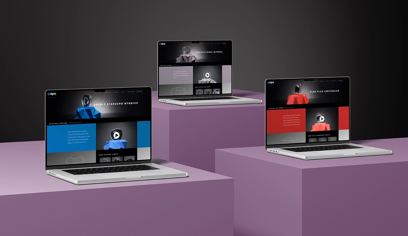
It's crucial that optical labs see the precision of Epic's capabilities as seen in each of the specialty lenses. As such, I captured with a photographer 360 videos of each lens. For the UI, I documented that upon hover, each lens' video should start and stop, which you can see in the screen capture below.
As a B2B site of traditional users, an above-average number of users are on desktop, so I was able to take advantage of interactive features more accessible on desktop (that still degrade gracefully on mobile), such as here in the navigation, where users can directly see a photo of the lens on hover before they click to the respective page.
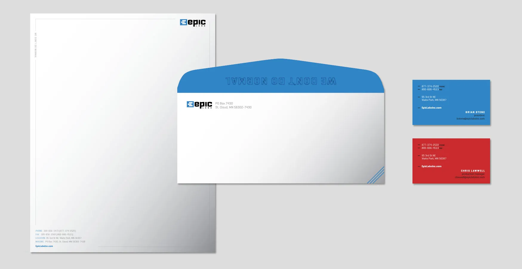
I used a subtle visual reference throughout of foreground and background repetition of headlines — a cue to near-sightedness and far-sightedness.
Throughout the stationery, I used Epic's tagline of "we don't do normal," which is conceptually reiterated through its location, such as its rotated placement in the upper left of the letterhead.

/ interjection / scandinavian
1 You’ve just taken in a lot! Some would call it “the end.” I, however, call it “the beginning” — perhaps of something beautiful. Let’s find out together.
© Copyright 2026, Samantha Bohn.
