background
- The CVB is responsible for promoting St. Cloud as a destination for conferences, events and tourism.
- Most of the CVB's efforts focuses on drawing conferences and other midsize to large events to the area.
differentiators
- St. Cloud regularly receives higher than average attendance for conferences, compared to other metropolitan areas in the Upper Midwest — due in large part to its central location within Minnesota.
- The CVB team is small but mighty — and known for being extremely upbeat.
parameters
- I was unable to change the CVB's logo or its website.
strategy
While St. Cloud's accessible location statewide is of no contest, its surplus of centrally located amenities and venues citywide is less known. With the Mississippi River as its backdrop, St. Cloud's key selling point to its most profitable audience of event planners is threefold: convenient location statewide and within the Upper Midwest; ease of access for event-goers to amenities; and the bonus stunning views of the Mighty Mississippi. The concept here is familiar. If you've ever purchased a house, you're looking for similar appeals: a quiet location, perhaps; quick access to the interstate; and, of course, beautiful views.
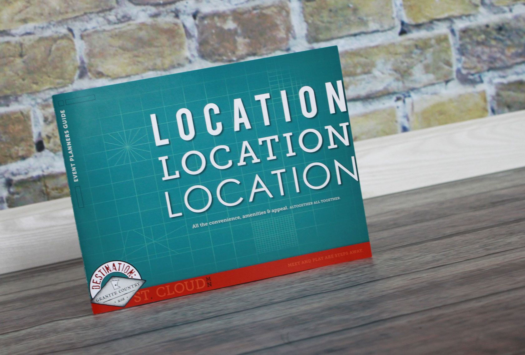
event planners guide design
This focal piece for event planners consolidates all must-know and compelling information about hosting an event in the city.
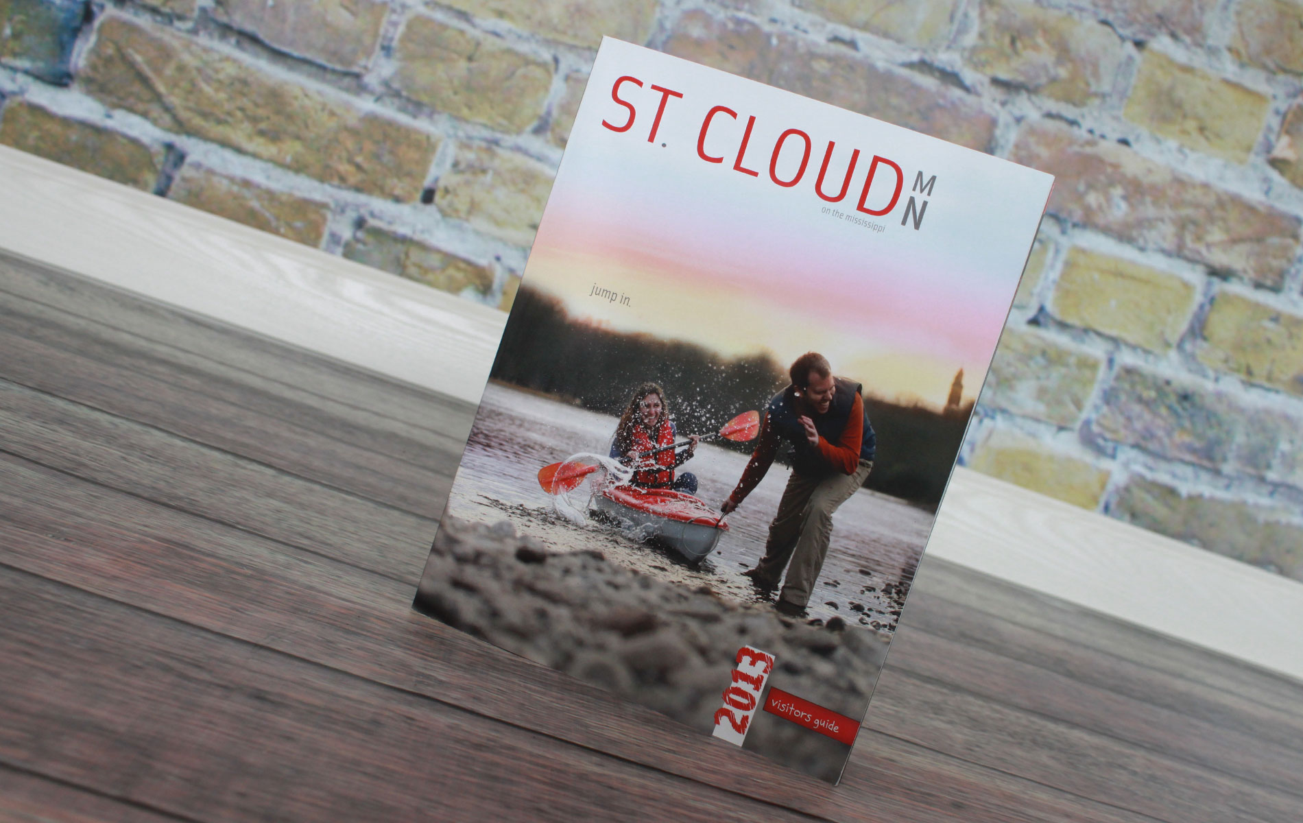
visitors guide covers
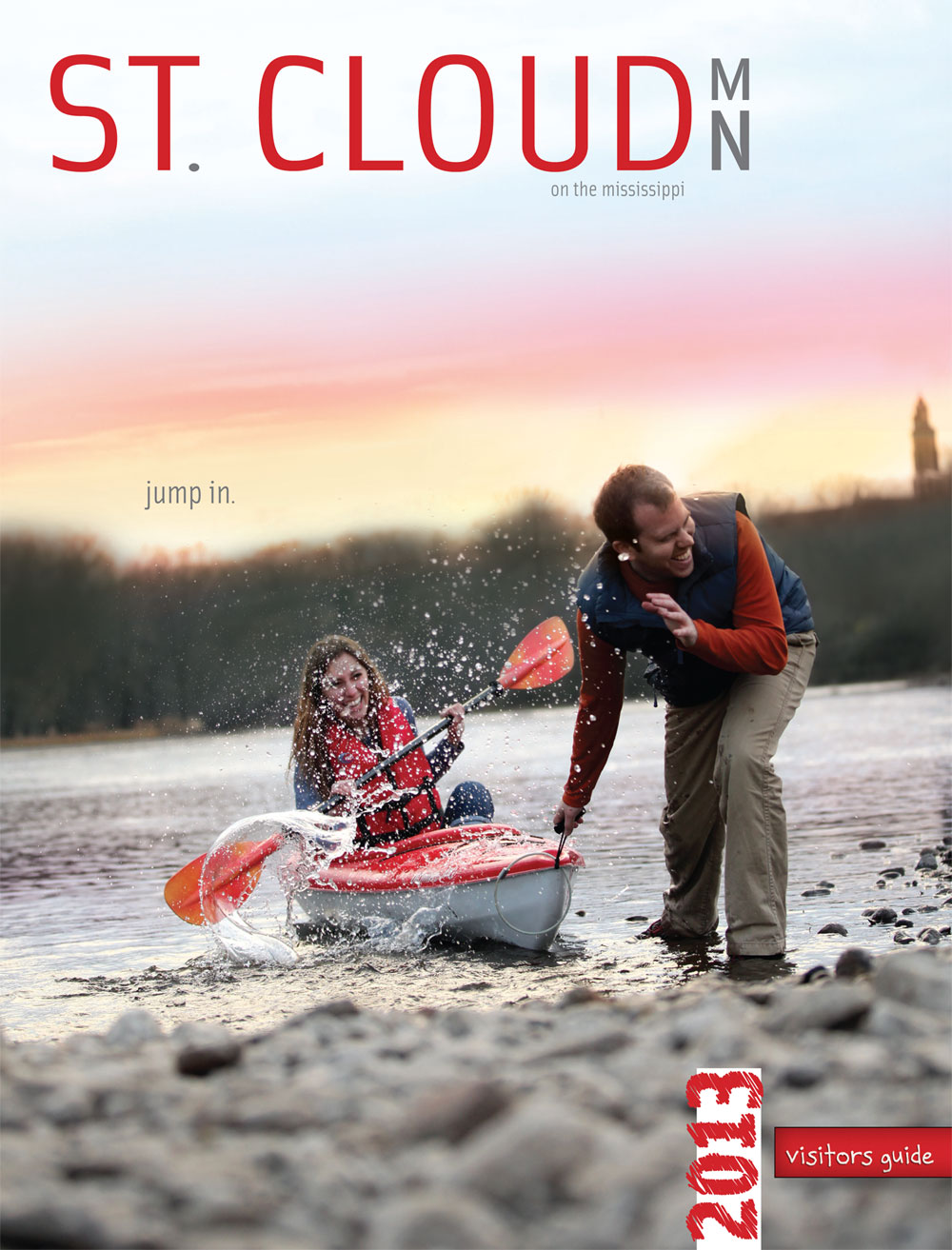
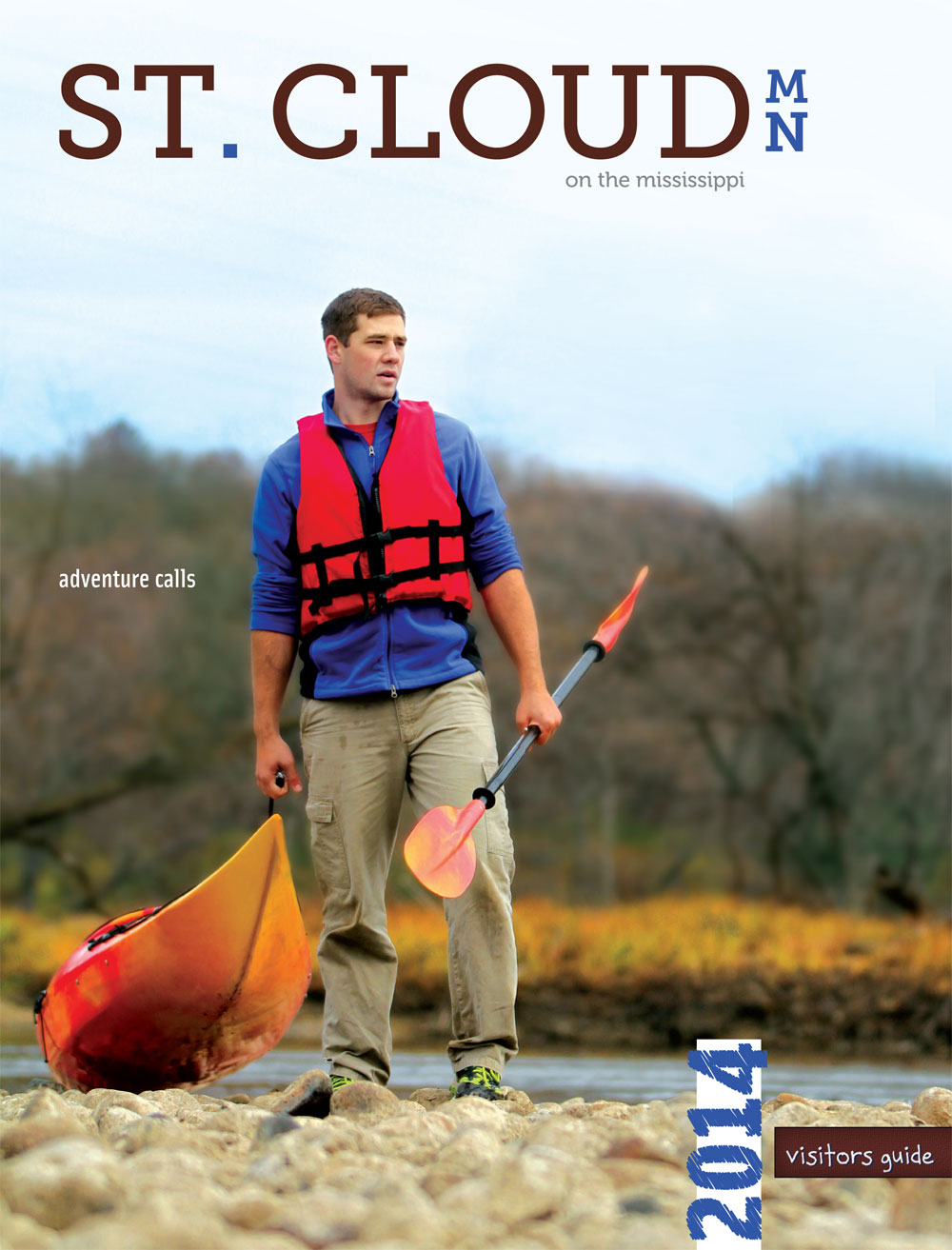
In 2013 I was asked to re-envision from scratch the cover of the visitors guide. Given the theme of promoting the Mississippi River in St. Cloud as a destination, I honed in on a creative direction, which I coined "imperfectly perfect moments." Together with my team we selected a stretch of the river most likely to draw those seeking outdoor adventure. The ensuing photoshoot led to several great scenes, but it was the last shot of the day that impressed us most. We led with this real moment between a couple right at sunset, which I amplified for the cover through attention to every detail of the photo including the final headline, "jump in," and the strategic placement of the church steeple to communicate that this spot on the river is actually right in the middle of the city. To finish off the cover, I re-invented how the masthead and year were displayed. I also was instrumental in leading the simplification of the cover by removing extraneous details and focusing on the draw of the cover on the rack. For the 2014 cover, the client elected to chose another photo from the same photoshoot.
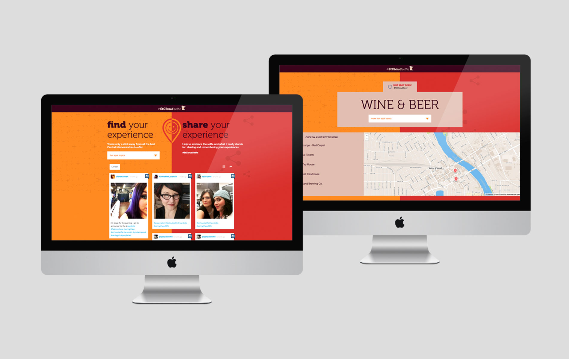
campaign website
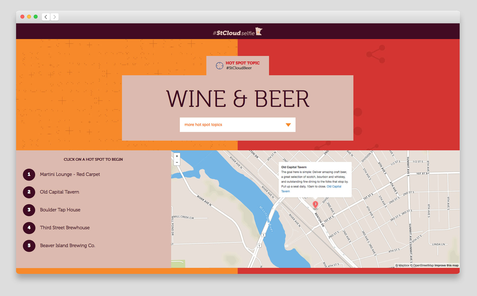
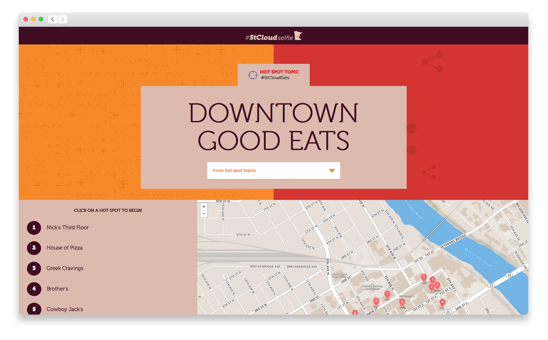
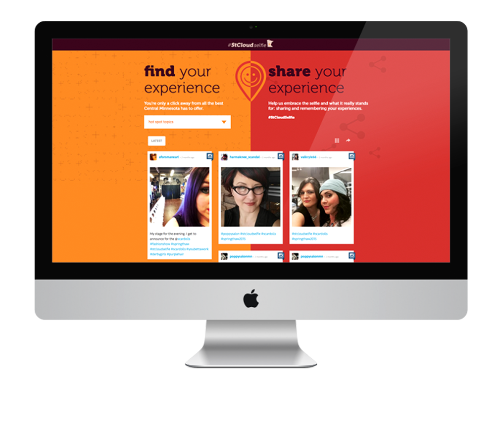
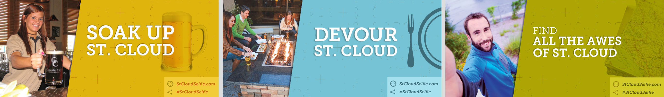
The CVB asked me to design a website and materials for a "selfie photo drive." Knowing people are hit up online constantly for this, I developed the concept into something more meaningful. The #StCloudSelfie campaign ultimately grew into a website offering self-guided tours for trending topics such as beer, where we simultaneously encourage people to submit photos at these sites. Shared photos then stream automatically onto the site.
mailer
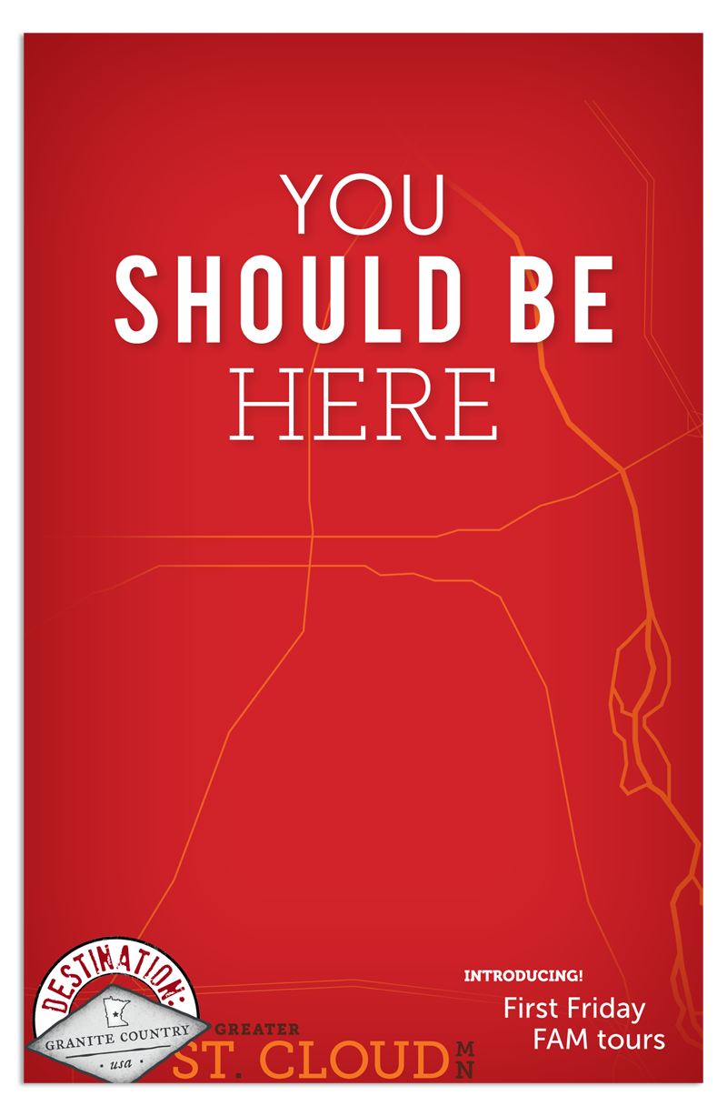
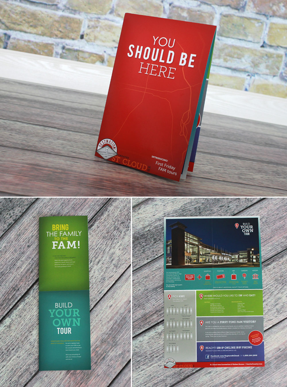
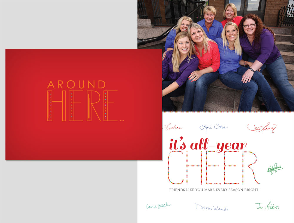
Balanced with a bit of levity, I developed the concept "you should be here," which reiterates St. Cloud's key selling point of "location, location, location," in addition to handling the design of each piece.
copywriting
Balanced with a bit of levity, I wrote headlines that reiterate St. Cloud's key selling point of "location, location, location," in addition to handling the design of each piece.
reception
- "The feedback we're getting on the 2013 Visitors Guide is incredible. The reaction is insane! We knew it would get a nice reaction, but not to this level. People are just loving how well it represents their community, and are really taking pride in this cover."
— Julie Lunning, Executive Director of St. Cloud Area CVB
- "I'm not a big fan of facilities guides in general; yours I liked."
— As told to Kelly Sayre of the CVB by Jon Schmieder, CEO of Huddle Up Group
/ interjection / scandinavian
1 You’ve just taken in a lot! Some would call it “the end.” I, however, call it “the beginning” — perhaps of something beautiful. Let’s find out together.
© Copyright 2023, Samantha Bohn.