roles: design | creative strategy & direction

kay's naturals

Challenge

Using the existing logo, rebuild Kay's Naturals brand to compete on shelf with mainstream gluten-free and "all-natural" products.

Solution

While many natural foods borrow the same look as their competitors (ample use of white, textures indicative of "natural"), research points to the success of packaging redesigns hinging on how disruptive they are on shelf. This redesign of Kay's packaging does just that.

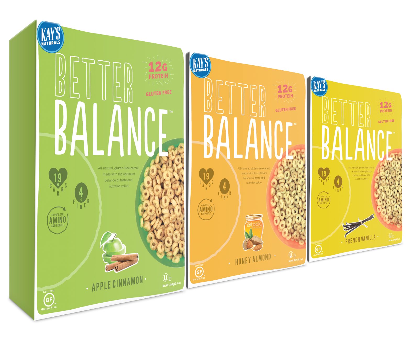
The design evokes the principles of "balance" by using half circles on either side of the box, which also results in a "continuous" look when packages are placed side by side.

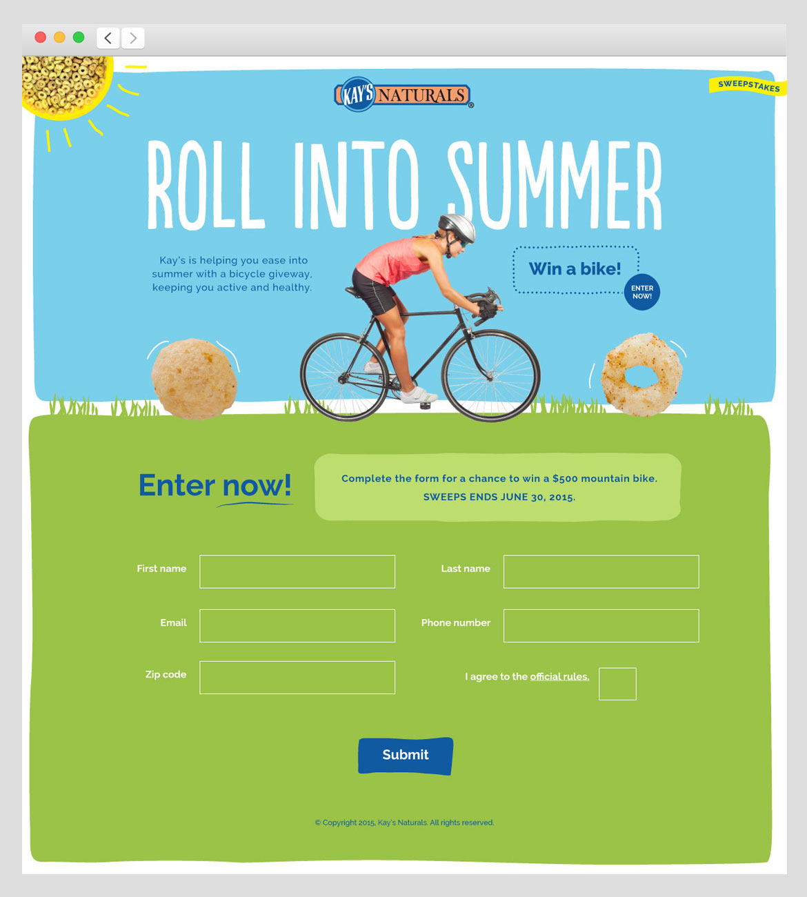
Following the packaging redesign, I was asked to design the look of a Facebook sweepstakes. Here is the landing page for that effort.

audience

Kay's has an avid audience of gluten-free consumers. Its protein-packed products — unmatched in the market — are tasty and filling options even for consumers not looking for gluten-free options.

reception

The client gave us a resounding "Yes!" And after getting unanimously positive feedback from Kay's various retail partners such as Walgreen's, Kay's was sure this direction was on strategy. After more internal discussion at Kay's, however, they opted to keep their existing package design. However, Kay's has plans to create a more mainstream product using this design in the near future.

Work done at Thelen

/ interjection / scandinavian

1 You’ve just taken in a lot! Some would call it “the end.” I, however, call it “the beginning” — perhaps of something beautiful. Let’s find out together.